A new agency brand, a whole new look.
Minimalist. But with maximum impact.
Minimalist. But with maximum impact.

The new website – and, with it, the new agency name – was launched at 11 p.m. on 24 June. FCB Hamburg is now called CarlNann. As such, the new corporate design of the agency is stepping into the light. It was, of course, produced in-house.
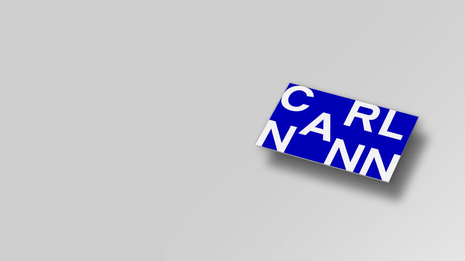
The logo is like a well-timed punch. No frills, no blah-blah, no pastel/mauve whatever, no lightning, no lighthouse, no anchor. Just CarlNann.
Deepest depths, highest heights.
Deepest depths, highest heights.

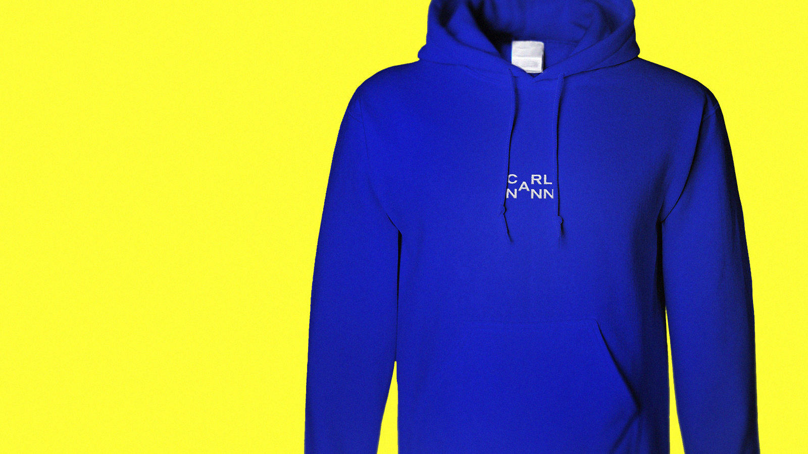
But there’s more than meets the eye. The logo reflects our internal mission: we want to get to the bottom of things, understand more than other people – and set the highest standards of the creative product. Our mission statement, ‘deepest depths, highest heights’, is reflected in the ‘A’. It goes down into the depths from CARL – before scaling the heights from NANN.
The logo takes the space it needs.
The logo takes the space it needs.

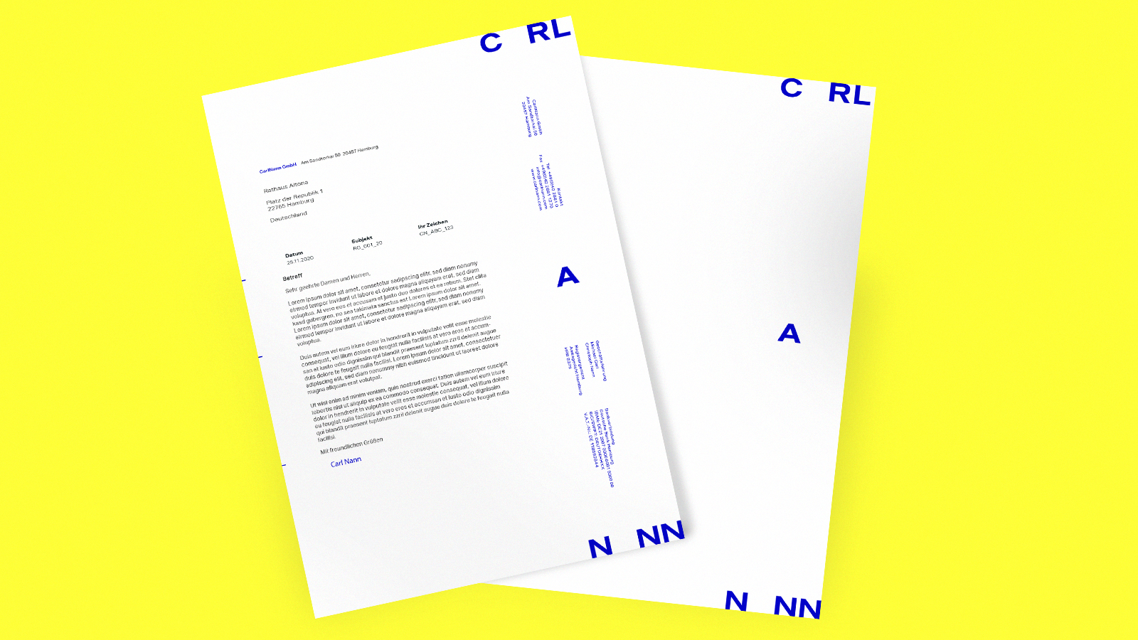
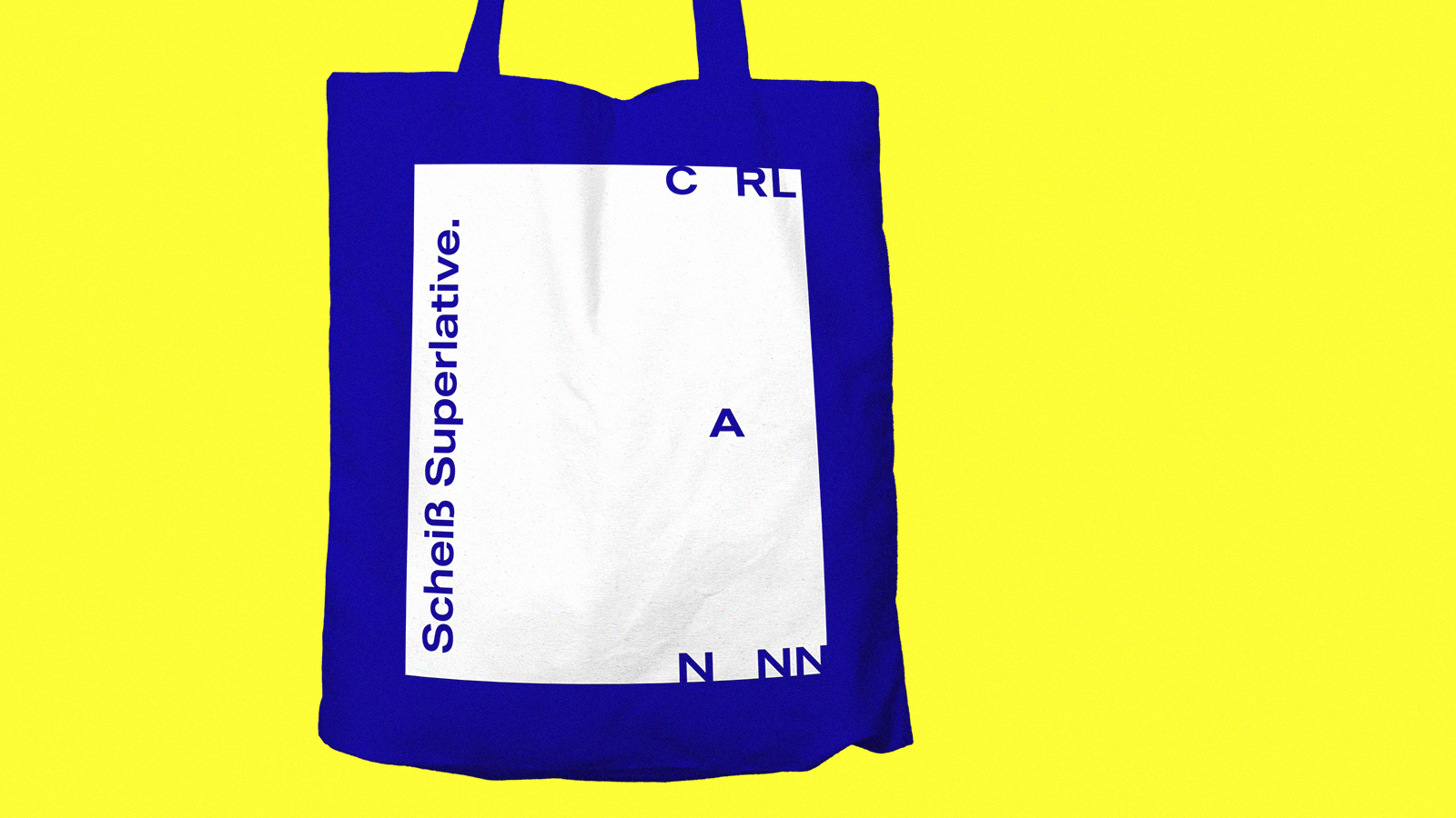
The corporate design fills the available space. The height of the logo is variable and is based on the height of the format. Right down to the bottom, right up to the top.


